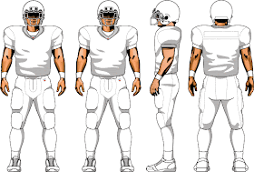
Sam's lesson for our football unit was on Logo and Uniform Design. He talked about image readability, and the requirements for a good logo (things like recognizability at any size, simplification of detail, the way your lines reinforce your message, etc.) Then we used the templates above to make up our logos.
I couldn't find everyone else's finished pictures, but mine is the blue bunny. He may not be fierce, but he's fast. :) The shark is what Sam drew as our example to follow. And Malachi drew that cute pink birdie on the bottom left helmet. I think it's marvelously simple.


No comments:
Post a Comment