
I thought the most useful part of this Logo Design assignment was when Sam showed us how to brainstorm. Since each child was looking for a personal logo that represented himself, Sam had them write lists of all the words they thought represented them in various ways. They wrote things they liked, talents, words that described them, etc.
Next, he had them draw symbols that might represent the words on those lists. Things like light bulbs for intelligence or curiosity, an eye to represent learning or looking for something, a smile or a flower or a starburst to represent happiness, and so on. Some words could have many associated symbols. Some words were more abstract (like "mystery" or "cute") so we talked about various ways to visually represent those concepts in a way everyone could understand.
Then, he had them draw connecting lines between concepts that were related or could go together in some way. They took the symbols that went with those words and tried to see how much "density" they could pack into those symbols. For example, a moon might represent mystery, light, astronomy, and women, and it might also look like a letter "C" or (turned the other way) like a smile. Sam had the children explore all these options visually, and he wanted them to do LOTS of these explorations! "Your ideas will get better and better as you keep exploring the possibilities," he said. He made them keep at it long after THEY thought they were done. :)

Here you can see Daisy's paper exploring some of the concepts she liked best. Penguins, curiosity, imagination, daisies and nature, happiness, reading, and mystery were some of the words she chose to describe her personal concept.
In the top left (circled) is the final logo concept she selected. It has a moon and a ladder going up into a cloud, representing imagination and dreams and fantasy. The ladder is whimsically curved (not strict and straight) and it's entwined with vines, showing her love of the natural world. And the whole thing forms a "D" shape, for "Daisy."
After she chose the basic idea, I helped her create a form of it in Photoshop. You can see the changes as we went through different iterations:

She liked the colors in this one, but they were distracting from the overall shape of the image.

Grouping the colors into an analogous color scheme made them less distracting, and changing the cloud shape made it stronger and less amorphous. Enlarging the crescent moon in proportion to the ladder gave more emphasis to the overall "D" shape.
Sam also taught the children that a good logo has to be readable and effective even without color printing. You can see that this logo works nicely in either color or B&W.
I really loved how Daisy's logo turned out! She worked hard on it. And the other children had great logos too! (Though some spent more time on them than others did. :))

Here is Malachi's personal logo.

Abe's, in black and white and color.

And Sebastian's. I love it. (It has an "M" for his company name, Monko.)
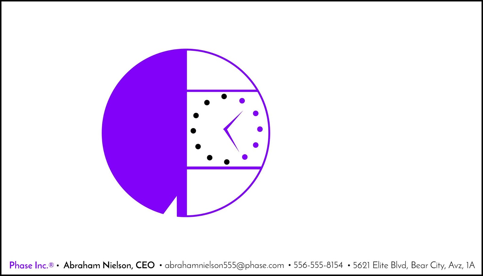
Here is Abe's logo on his business card, made for his company, Phase Inc. Abe has a very specific and minimalist design sensibility. He always has. I like it.

He also made company stationery/letterhead.

Ky's business card. ("Presidant." Haha.)

And Daisy's card for her company, "The Winding D." So great, right? She did almost all of this design by herself, though I actually executed it in Photoshop. She sat next to me and told me what to do and where to move things.
I'm not sure where Seb's business card ended up, but it was equally great. :)

No comments:
Post a Comment