Monday, May 28, 2018

Making (tiny) Tiny Houses

As I said, the Tiny House movement is apparently a big thing in some places, and it was fun to learn a little more about it. Not sure it's compleeeetely practical with 8 children, but I'd love to live in one by myself! Ha ha. So, this assignment was for each child to make a tiny Tiny House—by which I mean, we used floor plans for real-life Tiny Houses, but we made them truly tiny! Dollhouse size.
My wonderful friend Carrie Ann, who teaches Interior Design at BYU, came over to teach a model-making workshop. She showed us how to cut foam board and make corners, how to attach flooring, how to use architect's scales, and so forth. She also brought examples of some of the models her students have made for Interior Design assignments.
After the children had some idea of how to go about constructing models, they went online and chose floor plans from real tiny houses. They converted the plans to 1/2" scale in Photoshop, and then printed them out and pasted them onto foam board.

The assignment was for each child to design a house that he or she could personally live in. (Daisy and Junie's house was for both of them.) They had to consider storage needs, cooking, bathrooms, etc., and use actual appliance dimensions, but they were allowed to customize the house to contain the things that they needed most (and leave out the things they didn't).
Two of the floor plans
It was so helpful to have already made a bunch of mistakes during our workshop with Carrie Ann, so we knew what to watch for when making our actual model houses!
Yes, there were still hot-glue-gun burns. But fewer of them than there might have been!
I was truly amazed at how well the children did with this assignment. They all got really into it (except maybe Malachi, who needed lots of help from Abe at the beginning—but he did a great job once he got going!) and I couldn't believe the darling, creative little touches they added to their tiny houses! We worked on these for about a week and half in all.
Malachi's house from above. He has a bedroom, a kitchen, a living area with couch, a desk, and a bathroom.
Malachi's toilet, sink, and desk with computer.
Sebastian's house from above. Seb's was probably the most meticulously constructed of all the houses. All his corners were tight and perfectly square, and his measurements were exact. He had a little shed with a separate entrance at the back of his house, plus a bathroom, kitchen/living area, and a computer area. ("I just sleep on the floor, or in my hammock," he said.)

More details: we took pictures of the girls (front and back) and printed them out tiny (to scale) and glued them onto foam board. • Here is Daisy standing at the sink washing dishes and looking out the cute little curtained window. • The girls have bunk beds with a ladder, and two tiny stuffed animals (a pig and a penguin) to snuggle with. • In the laundry room, you can see a washer, a clothesline, and two folded towels. The pink thing at the bottom is a bowl sink Daisy made, with a faucet over it.

A house fit for a queen—or two! Such a fun, fun project!

Friday, May 11, 2018

Construction Unit Study and Lesson Plan

I knew a unit on Construction would be fun for 3-year-old Teddy (and his grown-up counterpart, 12-year-old Sebastian) but I didn't anticipate how interesting ALL of us would find it! We have a few friends who are in the field of construction management, so we loved talking to them and getting to know a little more about what a construction career is like.

A few miscellaneous links:


This PVC house looks like something Seb would love to build. Maybe we'll try it another time.

Here's one of a zillion videos you can watch showing tiny houses for sale. They are so cute! I knew this was kind of becoming a trend, but I didn't know HOW popular these tiny houses have gotten. Apparently there are whole reality shows about them, etc.

We always like a good implosion/demolition video! There are more demolition resources here, from our Fireworks Unit. The girls did this same demolition activity with blocks again, and they loved it!

This bridge demolition was pretty cool too (done with heavy equipment, not explosives).

Some pictures of the night we had a guest speaker who is an Estimator for a construction company:
Kids listening to our guest speaker (enthralled) :)
He showed us his construction estimating software, and even bought some huge floor plans/blueprints for us to look at! It was awesome.

Friday, March 30, 2018

Etiquette Unit Study and Lesson Plan

We felt that all of the children could benefit from a little brush-up on their Etiquette skills! This was a fun little unit, ending with lunch at a (somewhat) fancy restaurant for practice, at which there was only one incident where a gentlemen shoved a lady off her chair, hissing "I was there first!" at her…so…pretty good? :)

You can look at the lesson plan for more specifics, but we really enjoy The Art of Manliness blog for gentleman's etiquette and just all-around interesting information. We watched MANY of their videos, but ones we particularly liked were:

• this one about the proper way to iron a dress shirt (which we practiced, but the little ones practiced on napkins. I remember my mom having me practice ironing on tablecloths and napkins when I was little, too!)

• this video about table manners, and
• this one on how to end a conversation (such a useful skill!)

But by all means do go and check out their other offerings on such subjects as how to chop wood and how to unclog a toilet! :)
Here is a nice formal place setting from our fancy dinner at home

And some more links:

Article about opening doors for women

A funny old (but still good) instructional video about manners

This page links to several etiquette guides from earlier eras. These were fun to read.


This old WWII-era film on handkerchief etiquette was quirky
Daisy, at the aforementioned fancy restuarant

Monday, January 29, 2018

Print Ad/ Book Cover Design Assignment

After designing their logos and business cards, the children were ready to do their Print Ad. There is a LOT of design and execution that goes into making an ad, so I was just looking for them to demonstrate that they understood some of the concepts and design principles we talked about. They could either advertise a product, or redesign a book cover. Daisy was the only one that chose to do the book cover.

She worked really hard on it, choosing to use an old photo of herself for the goose girl, and clip art geese with clip art crowns. She learned how to paste and rotate and scale objects in photoshop, and to erase backgrounds. She chose the color of the cover, and the black shadow around the geese and the girl, to show that "this isn't just a kids' book, but it's a little bit scary and adults might like it too!" I love how it turned out! I might even like it better than the original. Note that this book is published by her company, "The Winding D."
I'm sorry to report that Sebastian and Malachi put off making their ads until they were nearly due, and as a result made them a little less polished than they could have. Both of them could have stood to do a few more concepts and rewrites. (Both of them could also do with a little less of the smart-alecky ad copy...but such is life with preteens! Ha ha.) Here is Seb's "Shmelf."

Some of Malachi's thumbnail sketches
And here are the last two version's of Malachi's "ad-making machine" advertisement. He thought his deliberate use of the Papyrus font was pretty darn funny in the left version. But after Sam's feedback, he ended up using the version on the right. "Lape" is his company name (I can't remember what it stands for...if anything).

Abe, my future businessman, LOVES doing this sort of thing and does it even in his free time. He came up with a music and movie subscription service catering to the "elite customer." He tried to suggest elegance and money-is-no-object in every line. He tried version after version, changing fonts and line spacing, experimenting with colors and layout. He worked really hard making it exactly as he wanted it! And the final product, printed out on glossy paper, really did look beautiful. Here it is:

Monday, January 22, 2018

Personal Logo Design Assignment

I thought the most useful part of this Logo Design assignment was when Sam showed us how to brainstorm. Since each child was looking for a personal logo that represented himself, Sam had them write lists of all the words they thought represented them in various ways. They wrote things they liked, talents, words that described them, etc. 

Next, he had them draw symbols that might represent the words on those lists. Things like light bulbs for intelligence or curiosity, an eye to represent learning or looking for something, a smile or a flower or a starburst to represent happiness, and so on. Some words could have many associated symbols. Some words were more abstract (like "mystery" or "cute") so we talked about various ways to visually represent those concepts in a way everyone could understand.

Then, he had them draw connecting lines between concepts that were related or could go together in some way. They took the symbols that went with those words and tried to see how much "density" they could pack into those symbols. For example, a moon might represent mystery, light, astronomy, and women, and it might also look like a letter "C" or (turned the other way) like a smile. Sam had the children explore all these options visually, and he wanted them to do LOTS of these explorations! "Your ideas will get better and better as you keep exploring the possibilities," he said. He made them keep at it long after THEY thought they were done. :)
Here you can see Daisy's paper exploring some of the concepts she liked best. Penguins, curiosity, imagination, daisies and nature, happiness, reading, and mystery were some of the words she chose to describe her personal concept.

In the top left (circled) is the final logo concept she selected. It has a moon and a ladder going up into a cloud, representing imagination and dreams and fantasy. The ladder is whimsically curved (not strict and straight) and it's entwined with vines, showing her love of the natural world. And the whole thing forms a "D" shape, for "Daisy."

After she chose the basic idea, I helped her create a form of it in Photoshop. You can see the changes as we went through different iterations:
She liked the colors in this one, but they were distracting from the overall shape of the image.
Grouping the colors into an analogous color scheme made them less distracting, and changing the cloud shape made it stronger and less amorphous. Enlarging the crescent moon in proportion to the ladder gave more emphasis to the overall "D" shape.
Sam also taught the children that a good logo has to be readable and effective even without color printing. You can see that this logo works nicely in either color or B&W.

I really loved how Daisy's logo turned out! She worked hard on it. And the other children had great logos too! (Though some spent more time on them than others did. :))
Here is Malachi's personal logo.

Abe's, in black and white and color.

And Sebastian's. I love it. (It has an "M" for his company name, Monko.)

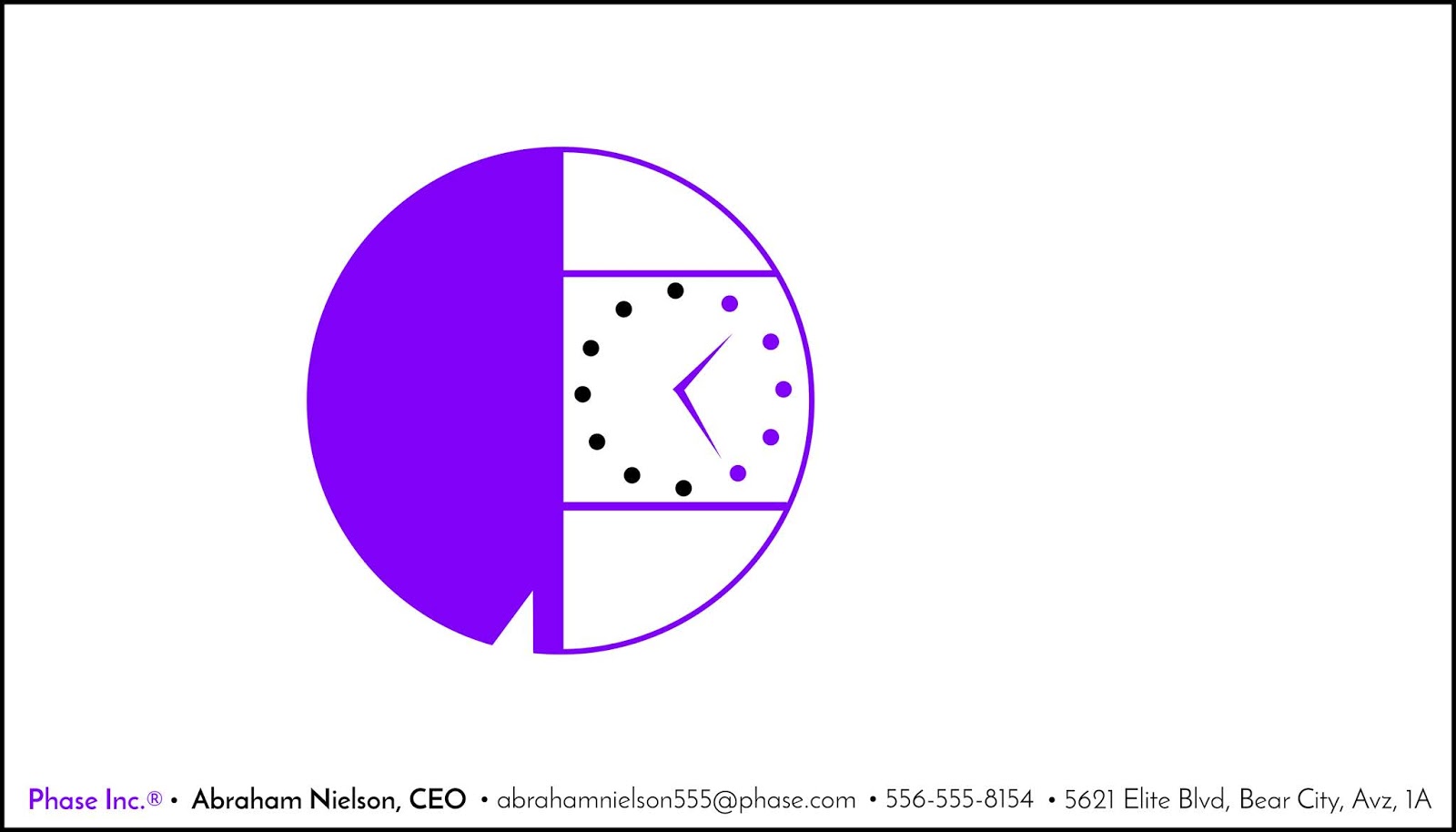
Here is Abe's logo on his business card, made for his company, Phase Inc. Abe has a very specific and minimalist design sensibility. He always has. I like it.


He also made company stationery/letterhead.

Ky's business card. ("Presidant." Haha.)
And Daisy's card for her company, "The Winding D." So great, right? She did almost all of this design by herself, though I actually executed it in Photoshop. She sat next to me and told me what to do and where to move things.

I'm not sure where Seb's business card ended up, but it was equally great. :)
Related Posts Plugin for WordPress, Blogger...